


Continuing Plein Air
- Christina Ann

- Apr 19
- 3 min read
Updated: Apr 20
Continuing in plein air has been so enjoyable. This week I ventured to a spot that I have often visited as a sweet devotional location. There is a big field with trails throughout the trees that surround it. Near the center of the field is a wooden cross with a bench setup in front of it. I love going to sit there to read and pray. When deciding on a place for plein air this week this was one of the first spots that came to mind. Sitting at the bench with the cross as my clear focal point.


This week was another adventure in watercolor and gouache! I first lightly sketched out my area and subject then filled in the basic colors with watercolor. When working with watercolor it can be quite opposite from the oil painting process. Because of the transparent nature of watercolor it requires you to lock in your lights and work light to dark.


Speaking of lights and darks, for our focus this week we, as students, were to focus on simplifying complex structures into clear value structures. I simplified a little by taking out some piles of dirt in the field and by letting the tree shapes blend together in the distance. For my values I decided to simplify the field by making values lighter in the back of the field, mid toned in the middle, and darkest in the foreground, while the trees in the back have darker values showing the shaded nature of the forestry. This gave my value structure a layered appearance with a clearer sense of depth.

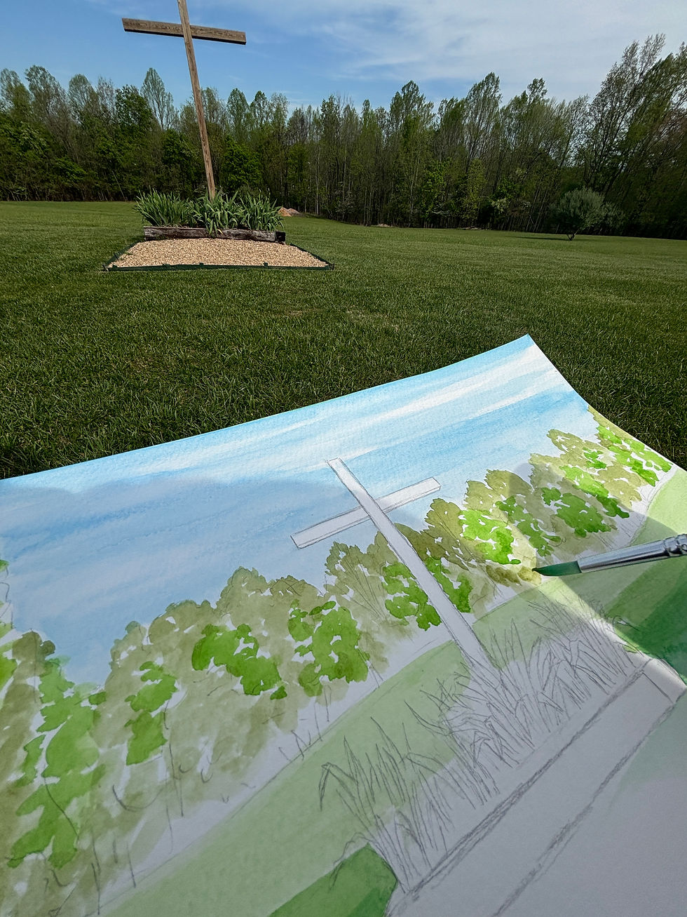
After deciding on my value structure I moved forward into the details and refinements in gouache. I intentionally made sure my cross was the most detailed portion of the picture because of it being the focal point. For my color palette I leaned in to the obvious analogous scheme that my setting provided. My colors stayed mostly in blues, greens, and yellows, with just hints of warmer tones in my focal point to draw more attention.

Even though I have been using watercolors and gouache while starting out this plein air section of class, I have loved the information I’ve been learning on the oil painting processes. I am hopeful to start oil painting this coming week and greatly enjoy the examples I’ve seen in class from the professor and other students! One of the helpful tips I’ve been learning about oil painting is the importance of a warm underpainting that brings depth to your shadows, this makes the deepest crevices of your work hot showing how the light is not able to escape. It was also covered in the sequence of oil painting to remember to work back to front, simple to detailed, dark to light, and to focus on your center of interest first. It is also helpful to remember the various methods of creating depth. Using atmospheric perspective to show things in the distant as cooler and softer, using linear perspective to show the lines receding into the distance, and adjusting your texture scales to read less defined in the background and more defined and gritty in the foreground. All this helps your work appear less flat.
Other helpful tidbits of knowledge I enjoyed studying this week:
Value can exist without color whereas color is always consisting of an attribute of value.
When deciding how to visually edit works of art it is helpful to understand the constant comparison that artists look for. For example, the same color can appear lighter and darker depending on which colors and values are arranged around it.
Look for ways to simplify by blocking out the large shapes of light and dark. For instance on a tree you would find the readable shapes rather than defining all the individual leaves.
On to the next week of painting, thanks for following along!
Jesus Bless You Abundantly!
Christina


Comments